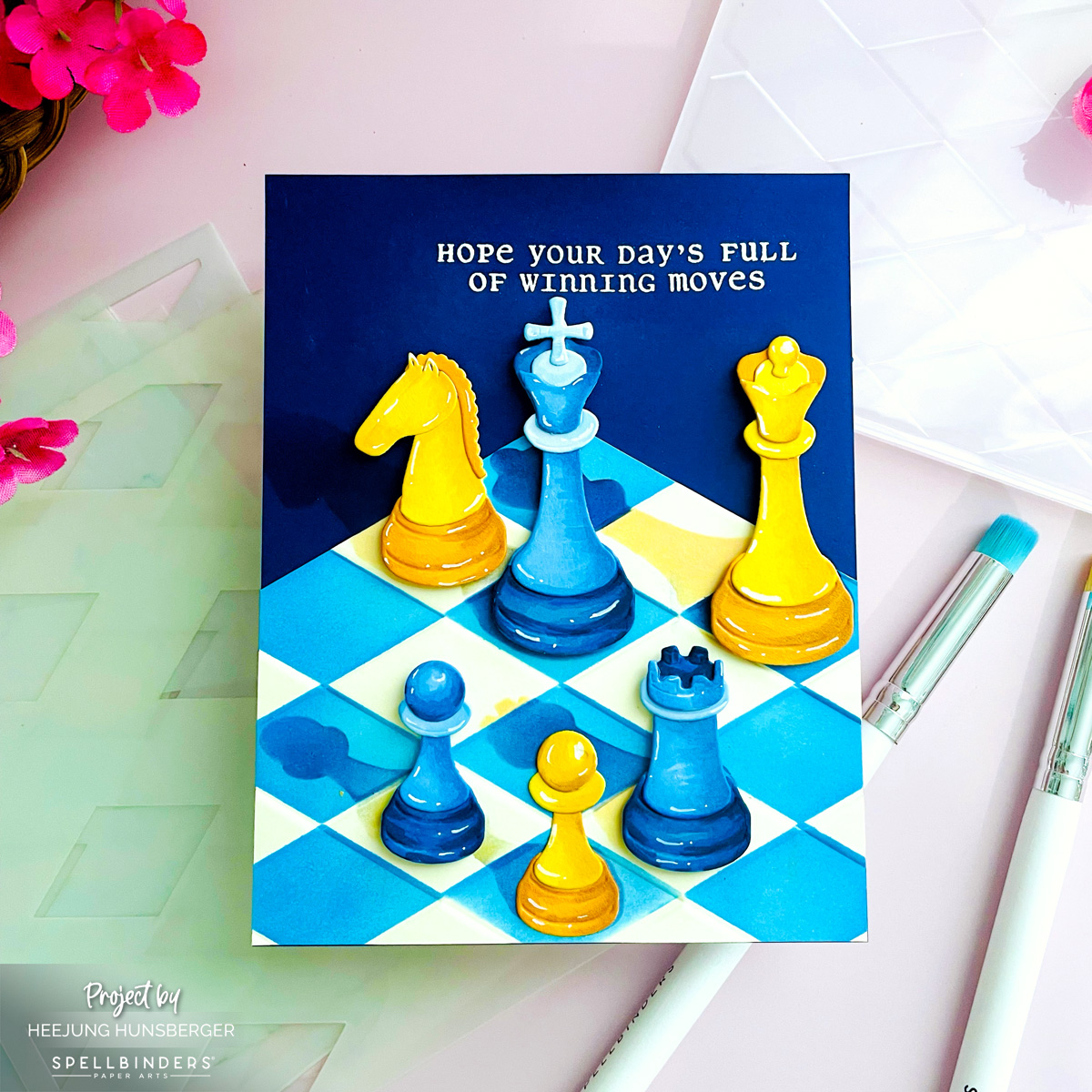
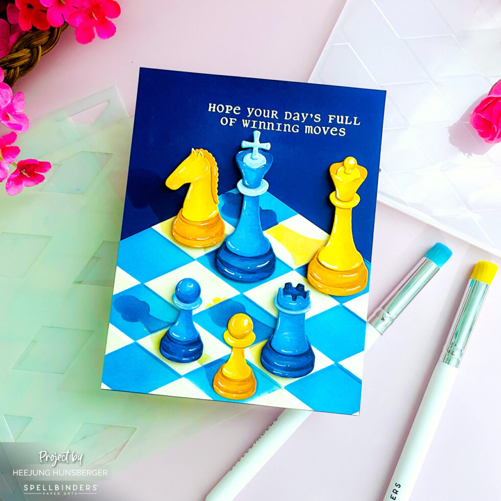
Hello, crafty friends! I’m back to share a fresh, high-contrast take on the Chess & Checkers Collection.
While my last project focused on soft, monochromatic tones, today I wanted to explore a bolder, more dramatic aesthetic. By pairing a textured Alabaster cardstock game board with a striking Cosmic Sky backdrop, I was able to bring a sophisticated, “game night” energy to life.
Card Making Process
Step 1: Creating the Textured Game Board I started the base of the board with Alabaster cardstock, which I embossed using the Harlequin 3D Embossing Folder. To create a crisp, single-color look, I blended blue ink over the embossed patterns. By carefully aligning the stencil, I achieved a clean, sharp checkerboard effect.
Step 2: Building the Dimensional Backdrop To create a sense of vertical depth, I trimmed the embossed board horizontally and mounted it onto a Cosmic Sky cardstock base. On the upper portion of the Cosmic Sky backdrop, I stamped a sentiment from the Chess & Checkers Stamp Set using VersaMark ink and heat-embossed it in white—the contrast against the deep blue is just stunning!
Step 3: Die-Cutting and Coloring the Chess Pieces For the pieces, I chose a vibrant, new color palette:
Blue Team: Celestial and Cascade cardstock
Yellow Team: Beeswax and Saffron cardstock I layered each die-cut piece for thickness and brought them to life with alcohol markers for smooth, glossy shading. I kept these pieces pattern-free so that the texture of the game board would really pop.
Step 4: Shadowing and Assembly With my layout planned, I stenciled shadows onto the game board to match the specific colors of the chess pieces, ensuring a realistic depth. Finally, I adhered the pieces using foam squares, creating a “popping” 3D effect against both the board and the deep blue sky backdrop.
Pro-Tips for This Design
Emboss Before You Cut: I embossed my Alabaster board first, then trimmed it to align perfectly with the Cosmic Sky base. This creates a fantastic “stage” effect for the chess pieces.
High-Contrast Embossing: Using white heat embossing on dark cardstock like Cosmic Sky provides a perfect anchor for the sentiment. It really stands out against the textured background.
Color-Matched Shadows: I made sure my shadow ink color matched the chess piece color (blue ink for blue pieces). It makes the light source feel natural and professional.
I hope this bold variation inspires you to experiment with your own color palettes! Whether you prefer soft, romantic tones or dramatic, high-contrast looks, the Chess & Checkers Collection offers endless possibilities.
Thanks for stopping by my blog today! Let me know in the comments which color combo you prefer—the soft pinks or this bold blue-and-yellow look?
Happy Crafting!
Heejung
SUPPLY LIST
When you make purchases through affiliate links, it won’t cost you anything extra. Thank you so much for your support! 🩷